London Calling I
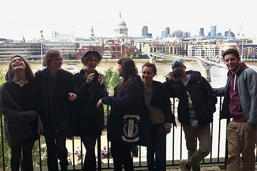
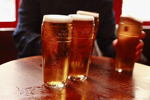
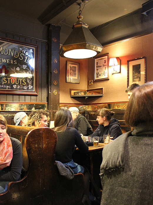
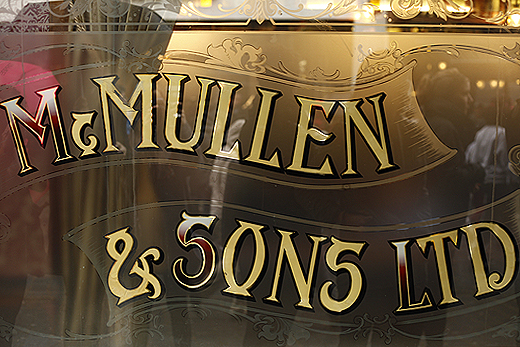
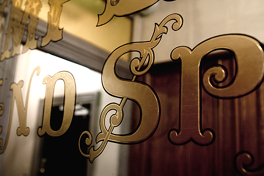
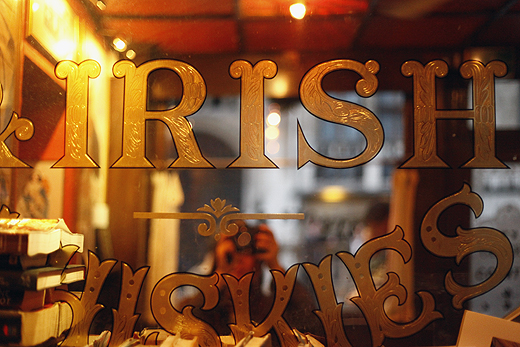
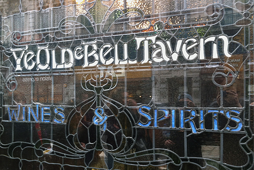
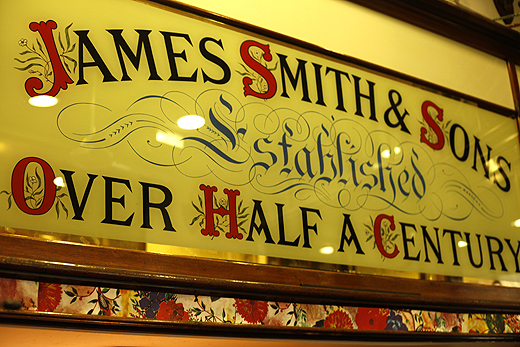
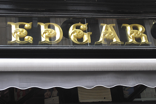
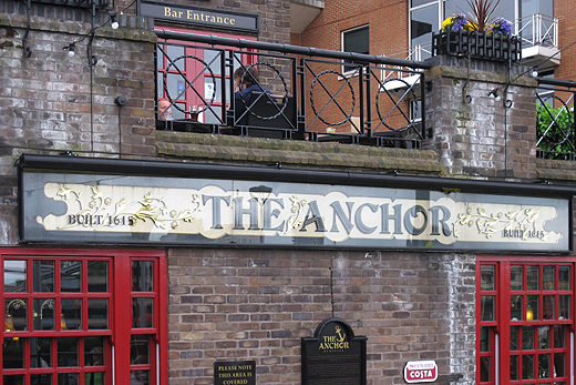
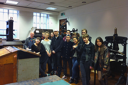
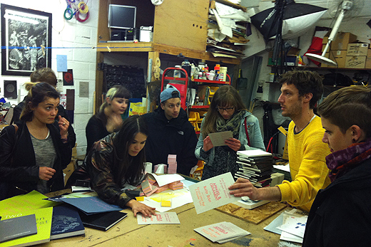
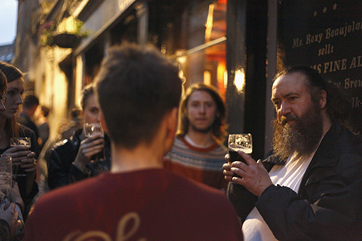
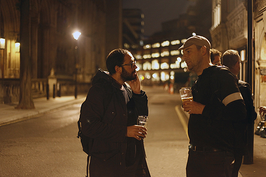
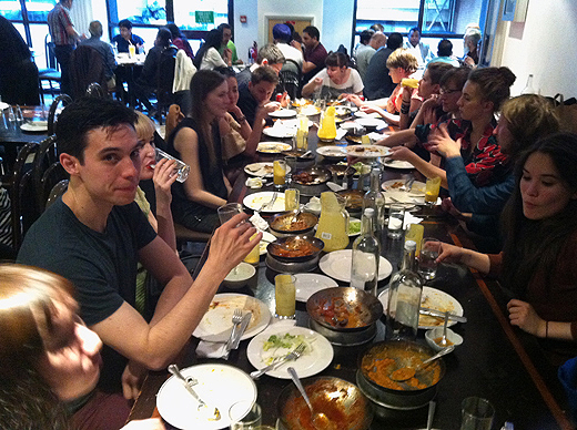
In the Summer Term 2013 a group of 12 students came to London for one week. The theme of the excursion was 'Pub Lettering'. This was not just a lame excuse for drinking lagers and ales. To understand British culture and design you need to understand the British way life. The best place to do so is at the pub. Pubs are at the heart of British everyday life, they are the extended living room, a social place of debate and exchange, British history and future. Pubs have their very own unique typographic tradition. In fact many modern British fonts are strongly influenced by the lettering seen on pub signs. We visited different kind of pubs and studied their unique typography, old historic pubs, posh pubs, workers pubs in the East End and busy West End pubs. The results were collated in a typographic documentation.
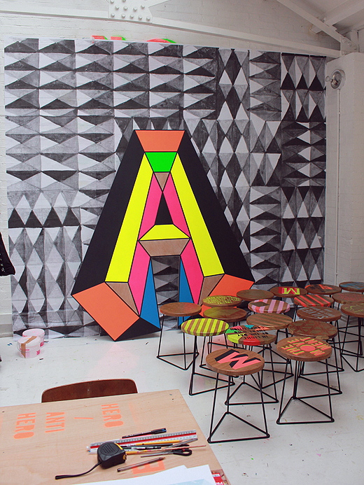
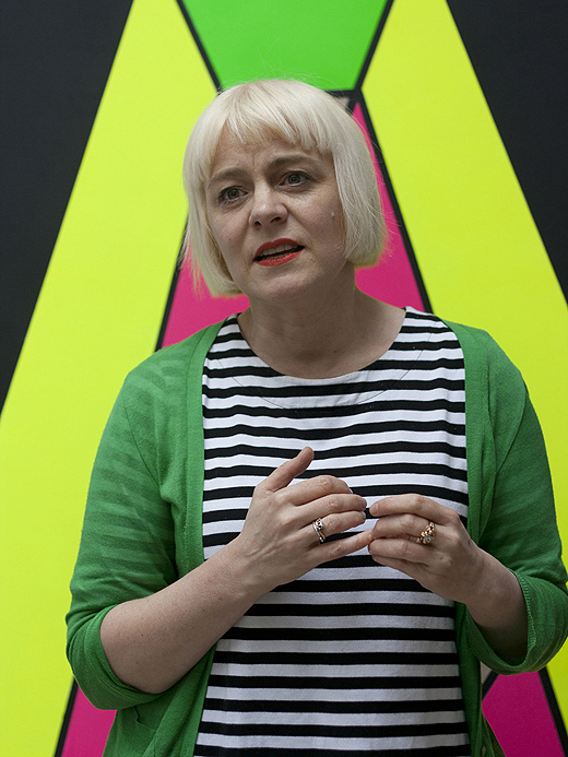
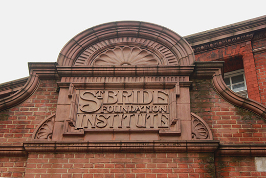
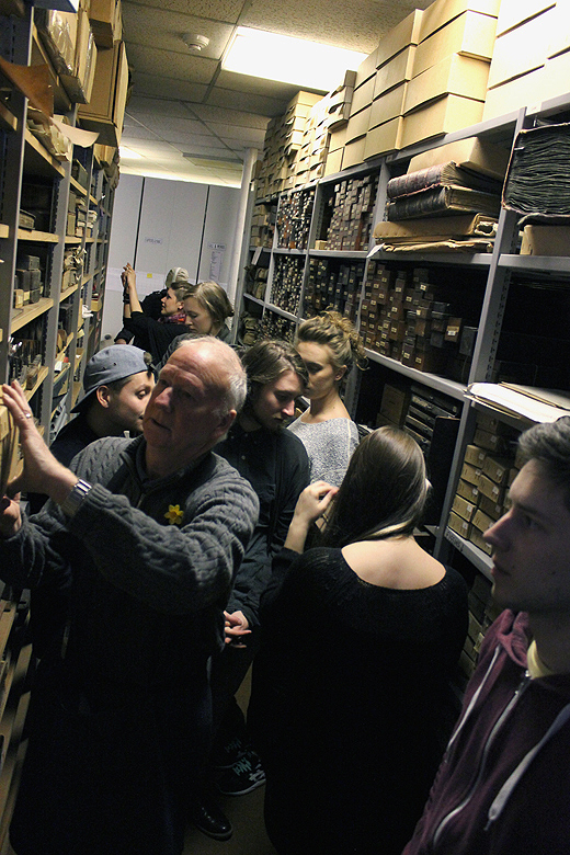
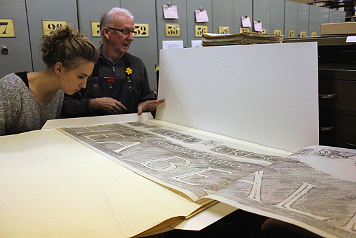
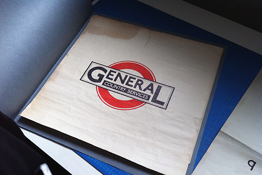
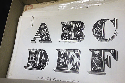
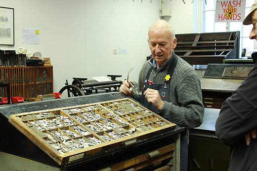
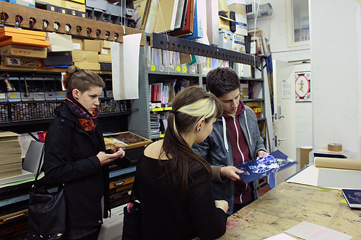
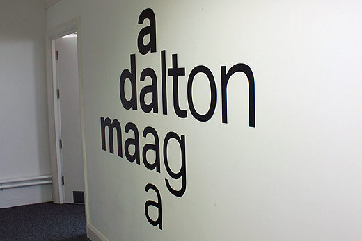
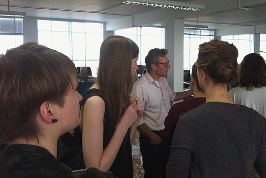
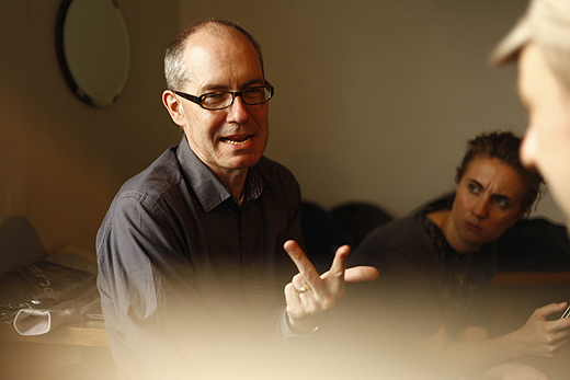
To put our research into context we also visited St. Brides Library and Christian Küsters showed us the new gigantic Central Saint Martins building. We met with great designers such as the fantastic Morag Myerscough, traditional signwriter Peter Hardwicke, Alex Bettler from Modern Activity, big scale type designers Dalton Maag, typography legends Phil Baines and Catherine Dixon, our friends from Julia, and letterpress monster Ian Gabb. A good week with some serious typographic milage and a lot of walking.
