1 plus 1
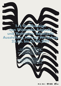
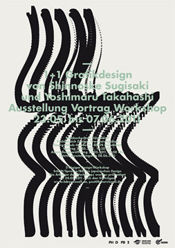
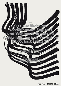
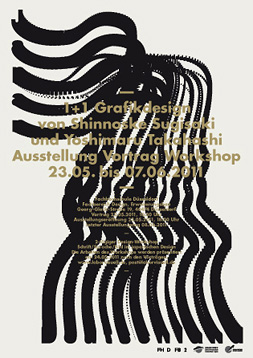
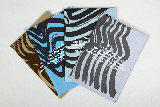
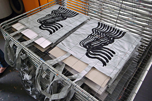
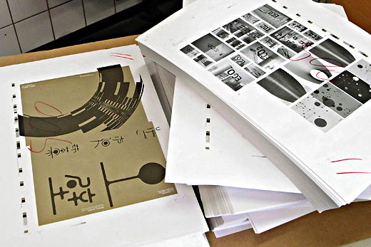
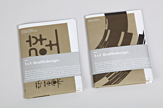
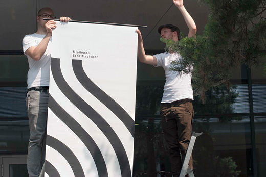
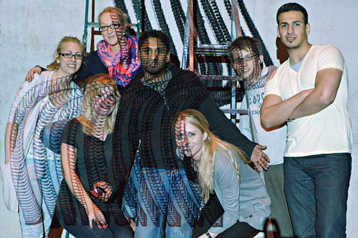
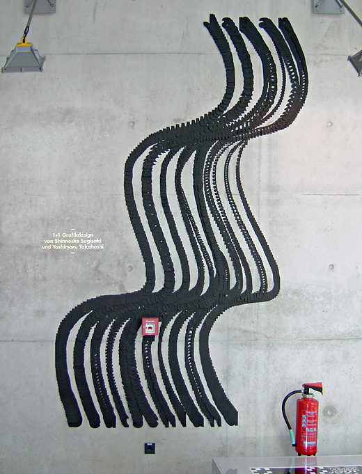
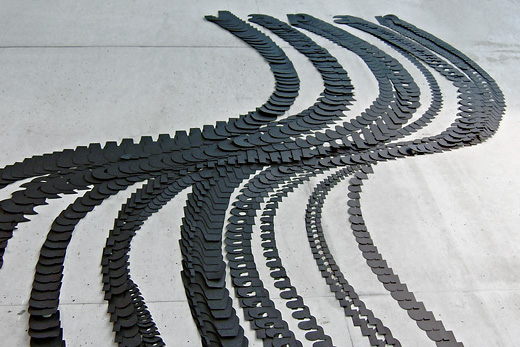
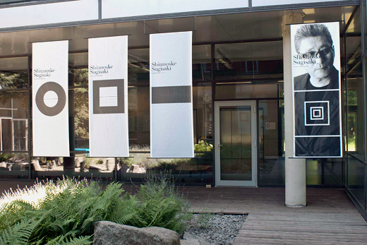
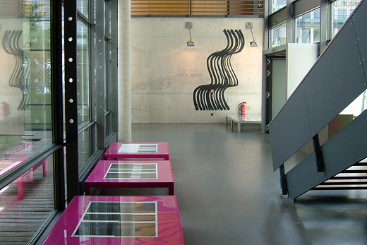
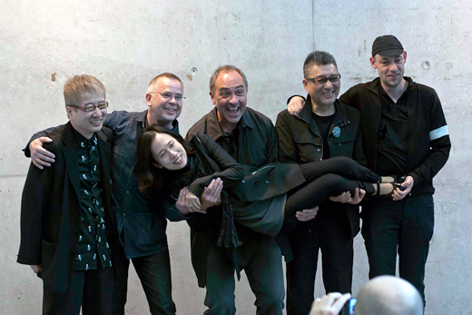
As part of the Japan Week at the University two Japanese designers,ĀShinnoske Sugisaki and Yoshimaru TakahashiĀwere invited for an exhibition of their work. The design proposal by final year student Tim Sluiters was selected to be developed as the identity for the overall exhibition. His design merges the letters of both country names 'Japan' and 'Deutschland'. It not only represents the friendly connections but also the journey that both visiting artists made. The theme was used for posters, invites, catalogues and bags. A group of students realized the graphic theme as a 3d wall installation whereby each letter and every transitional stage was laser-cut from black card.
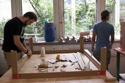
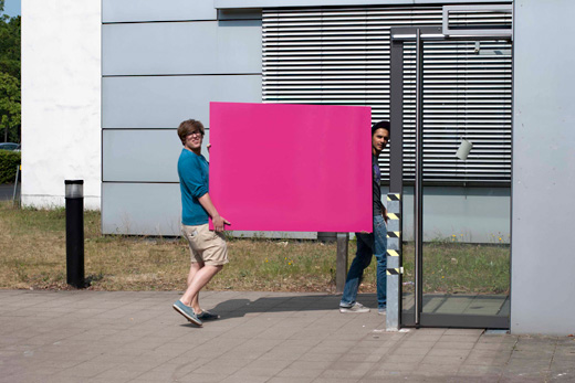
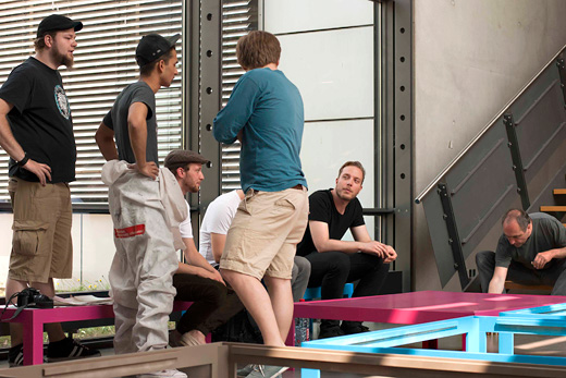
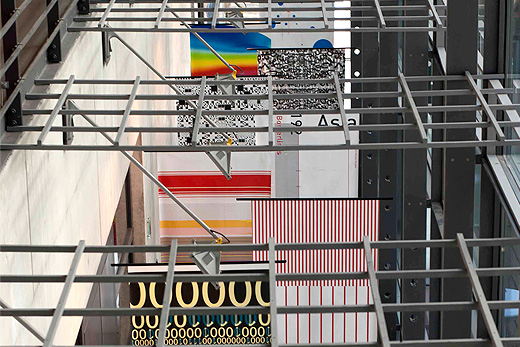
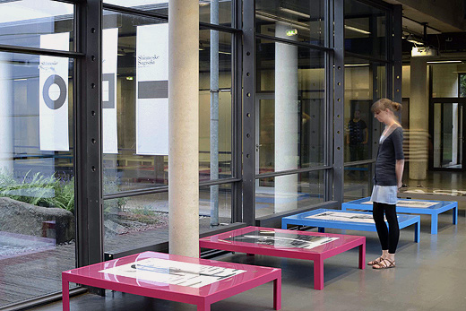
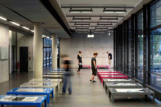
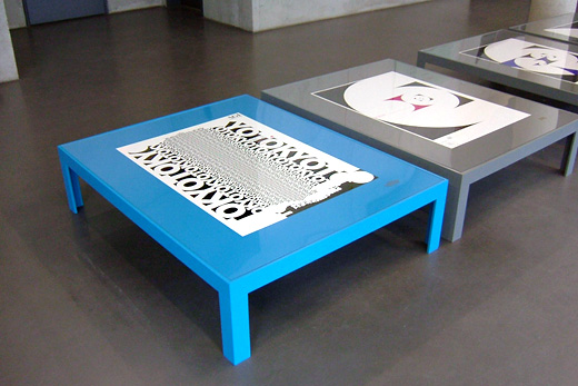
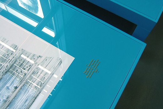
The idea for the exhibition display was developed by the studentsĀPatrick Mariathasan andĀMichel Guss. The idea was to use traditional JapaneseĀlowĀtables to display posters but colour those in a rather modern way, pink, cyan and grey. Benches and structures for hanging large banners were built in the Universities own wood workshop.
In collaboration with Prof. Victor Malsy and Prof. Phillip Teufel
Disclaimer: The copyright of all work shown here is with the individual students. No work shown here was produced by Mind Design or Holger Jacobs.
